Logo
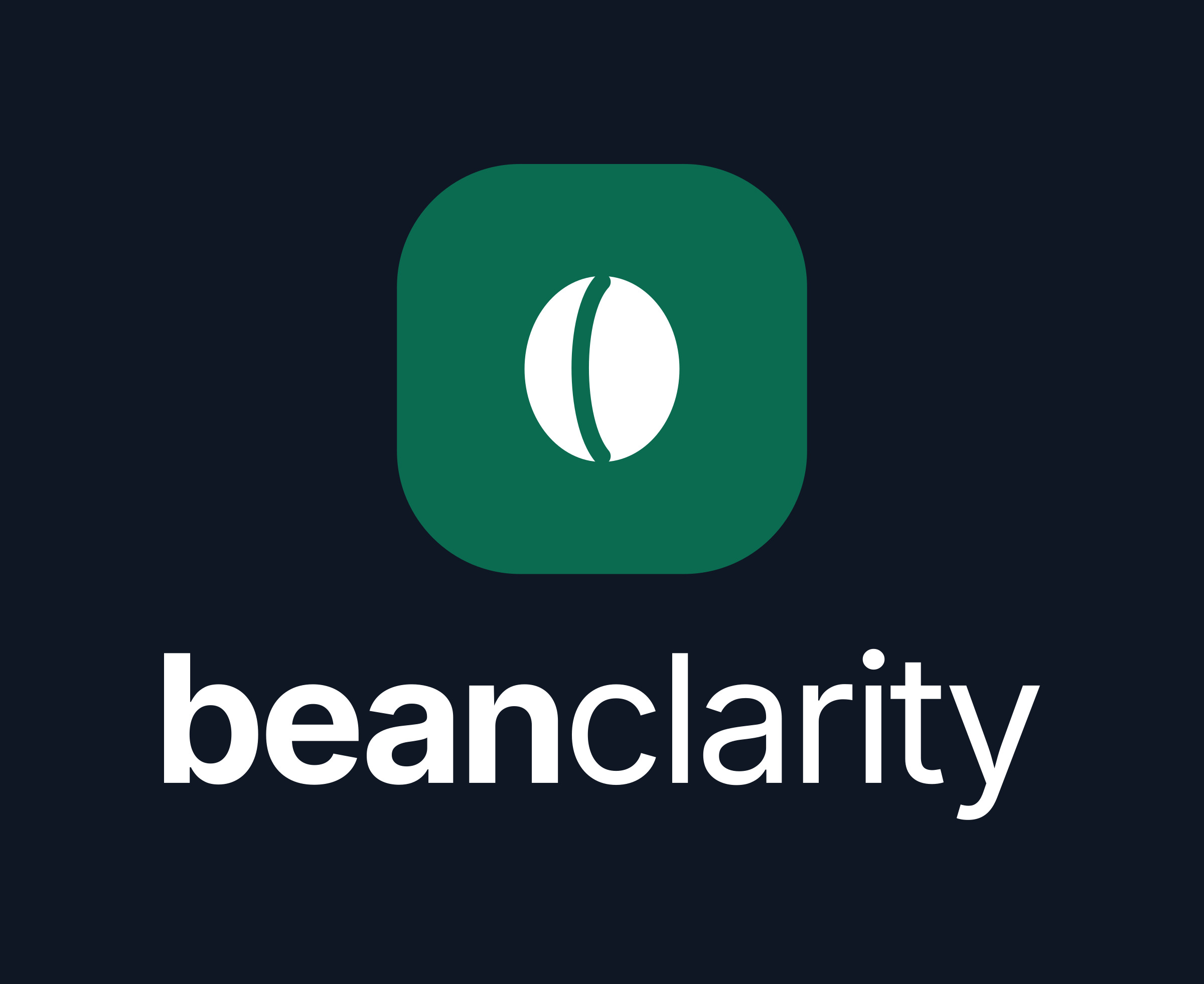
The bean icon beside the wordmark. Use the horizontal logo by default, the stacked logo in square spaces, and the wordmark alone where the icon already appears nearby. Every version comes as SVG, transparent PNG, and JPG on a solid background for Word and PowerPoint.








Icon
The emerald tile is our app icon, favicon and profile picture. The bean on its own is a small brand device for bullets, stickers and loading states, not a replacement for the logo.
































Colour
One brand colour, emerald, with ink for text and plenty of white. Use emerald for the icon tile, links and buttons, and keep large areas calm.
Type
Inter throughout. The wordmark sets "bean" in Bold and "clarity" in Regular, all lowercase, in one colour.
- Typeface
- Inter, free from Google Fonts
- Wordmark
- Bold 700 and Regular 400, letter spacing -3.5%
- In text
- Write the name as "Bean Clarity", two words, both capitalised
Usage
Give the logo room, keep it in its own colours, and don't redraw it.
Clear space and size
- Keep clear space of at least half the icon's height on every side.
- Use the horizontal logo at 120px wide or more on screen, 30mm in print. Smaller than that, use the icon.
- Pick the version made for your background: colour on light, reversed on dark, on-emerald on emerald.
Please don't
- Recolour any letter or the bean, or change the emerald.
- Stretch, squash or rotate the logo.
- Add shadows, outlines, gradients or glow.
- Retype the wordmark in another font or in capitals.
- Place the colour logo on a busy photo. Use mono white instead.
- Use the bean alone in place of the full logo.
Press enquiries
Interviews, data requests, or something not covered here.
hello@beanclarity.com
Social and sharing
Ready-made images for link previews, profile pictures and banners.